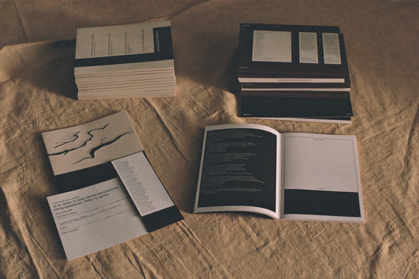
There is a version of brand work that ends with a beautiful eighty-page document, a presentation everyone enjoys, and a company that goes on making things that look nothing like it. I have delivered that document. It is a lovely artefact and a poor tool.
The problem is that guidelines describe a brand to someone who already understands it. What most teams need is something closer to a set of defaults — decisions already made, in the places where they will actually be making things.
The Friday afternoon test
Here is the only benchmark I trust. It is 5pm on a Friday. Someone in sales needs a one-page PDF for a customer call on Monday. They are not a designer and they are not going to read anything.
Can they produce something on-brand in fifteen minutes? If the answer is no, the identity does not exist yet, however good the logo is.
What we deliver instead
- Colour and type as design tokens, not swatch images — so they can be imported, not eyeballed.
- Templates for the ten things the company actually makes, built in the tools it already uses.
- A voice guide made of real before-and-after sentences from their own writing, with no adjectives in it.
- The mark in every format anyone will plausibly ask for, named so that the right one is obvious.
Rules, sparingly
Every rule in a brand system is a small tax on everyone who uses it. Some are worth paying: consistent type, a fixed palette, one mark used one way. Many are not.
Write down the three rules that matter and let everything else be a default someone can override.
A brand that is slightly inconsistent because people are using it beats one that is perfectly consistent inside a PDF and absent everywhere else.